Monday 17 December 2012

Snowflakes

I was a frequent user of Make-a-Flake but discovered 
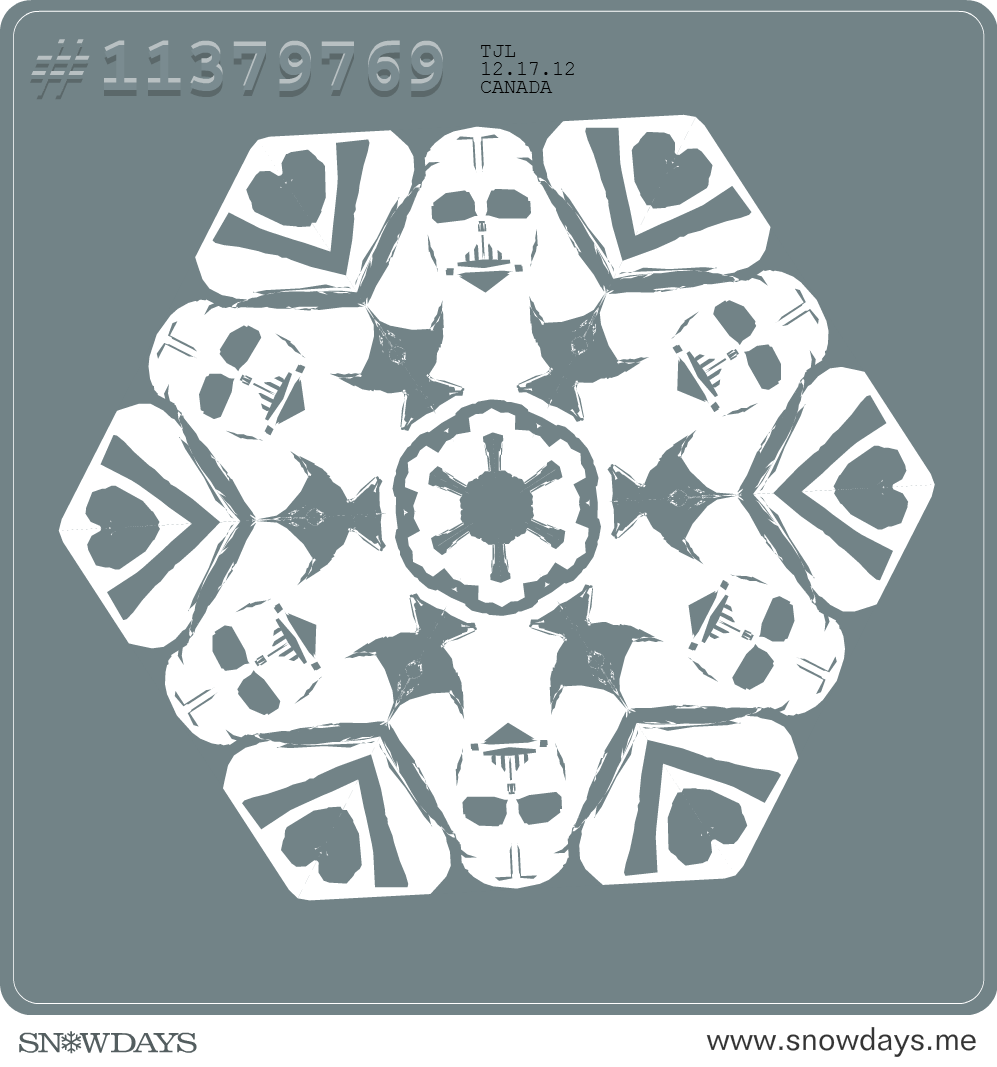
SnowDays this year. Make-a-Flake strives for authenticity: virtual scissors with sound and all cuts are straight and follow the laws of actually cutting a snowflake. SnowDays is a little more lenient. You can do polygon cutting or just click and drag cut, which allows for nice curves. The edges need not be honoured.
Plus you can view others' flakes and download them if you like them. It's a lot of fun to do. Here are some of mine.
Atom!
Mo-flake


Thanks @miken_bu and @MattersofGrey for this one!
Guitar or Dress?
Apple
I'm experiencing the craziness that is the week before Christmas doing a video workshop in an elementary school this week. I thought this might a fun way to for the teacher to save her/his sanity, the students to play and use symmetry and shape math skills too.

Sunday 16 December 2012

Fonts

I love writing. Usually this is said about the process of writing and, yes, I love that, but I love the writing itself: the letters, the shapes, the individuality, the variation, the history.
5 different alphabets and 5 latin fonts.
Throughout my life much of my spare time has been spent on letters. I've learned the English alphabet, French alphabet, German alphabet, International Phonetic Alphabet, and Greek alphabet. I'm working on Cyrillic and Hangul, have a table of Futhark runes somewhere, and have spent some time looking at abjads, Hebrew and Arabic, where vowels don't get to be letters, and syllabaries too.
I also make my own. This has primarily been in notebooks or sketchbooks, on loose-leaf, scrap paper. I don't remember them all. Once I borrowed from Greek to expand the English alphabet into a phonetic alphabet. I've made a syllabary or two. Recently I tried to make a non-linear alphabet where successive vowels would be represented by different coloured triangles within triangles and consonants would be represented by four different diacritical marks in one of six quadrants. Initial consonants would be "open" and final would be "closed". It looks something like this:
I've nicknamed it TriForce
These alphabets I've made don't get much use. I test them out with the names of relatives and friends. The quick brown dog jumps over the lazy fox is very frequently written down, but beyond that my alphabets have  not done much. Kristin and I would often write notes to each other and grocery lists in Aurebesh, an alphabet developed for Starwars. When I'd sit in on friends' university classes I would often take notes in a transliterated and slightly modified Greek alphabet (I added a ' on top of chi to represent English's [ch] sound.).
Now the internet has exploded. Any sort of font you want is available. I frequent sites like www.1001freefonts.com, www.dafont.com, and even www.fontsquirrel.com, but there are so many more! "Free fonts" turns up 42.4 million results as a google search.
I've downloaded fan-made Aurebesh fonts, fonts imitating ancient Roman inscription, many handwriting fonts and the list could just keep going. You simply download, unzip the file and copy it into your Windows Fonts folder and it works in all YOUR programs (after you close and reopen them if they were open during the font installation). I've learned the hard way that they don't transfer to other computers. Find an awesome font for a title for a project? Open it up on the school computer and it's reverted to Arial! I've come up with two solutions: 
1) I carry fonts around with me on my flashdrive.
2) I open paint, type what I want in the font I want, and save it as a .png and insert it as a picture into whatever I want it to be in. Like I've done with this post. Here is a sampling of my downloaded fonts:
Even better than all the free fonts available online -- yes, something is better than that -- is www.fontstruct.com: where you can BUILD YOUR OWN FONT!!! All my alphabets can now be typed. I've played around with this a fair bit and recently made an alphabet I've called Runic
It takes Germanic Runes as its inspiration, but separates consonants and vowels stylistically. Consonants are vertical/quick and vowels are horizontal/long. Mulitple vowels in a row are stacked on top of each other, so all the numbers, special symbols and most punctuation marks are actually dipthongs. The little slash through some consonants or over some vowels represents a space. If you want to download it, feel free. Leave a comment or email me and I'll send you a keyboard map of the font too. Oh, I also added a symbol for ŋ (The sound we usually write as 'ng', though it shows up in words like bank and pink too.). I can now type a word document totally in a font of my own making and print it and hand it in. I've just assumed that if I've printed it is for an assignment, though thinking about it I might just print a page to see my font printed.